

Navigating Knapsack
Overview
The editorial interface is available both in the cloud and when working locally, providing a user-friendly way to manage your content. By using the Knapsack UI, Admins and Contributors can efficiently publish and manage content while adhering to established Git workflows.
Admins have the flexibility to merge changes directly into production or commit changes for review by other team members or system administrators. Contributors, on the other hand, must request a review from an Admin before their changes can be published. Knapsack dynamically generates branches and pull requests (PRs) in the connected Git repository, ensuring every change is recorded as a permanent entry in the version history of your design system.
Admin Bar
A Comprehensive Dashboard for Managing Your Workspace Settings and Content
The Admin Bar is your central hub for accessing and managing various aspects of your Knapsack workspace. It provides quick access to essential settings and tools, making it easy to navigate and maintain your design system.

Accessing Workspace Settings
Easily access and modify your workspace settings to keep your environment configured to your needs.
Design Tab
Access your system’s design tokens, Figma variables, collections, and modes.
Document Tab
Create and manage the front end of your design system using a combination of content blocks and other embeddable utilities.
Patterns Tab
Monitor the status of all components within your system. This dashboard allows users to add Figma comps, dynamic documentation, and component templates, using smart algorithms to recommend templates and Figma comps for existing components.
* For Local Development
Use the “Preview Changes” button to see real-time updates of your work.
* For Cloud
Utilize the branches menu, edit button, and publish button for managing and publishing your changes.
Edit Your Profile
Update your profile information and preferences.
Primary Navigation
Efficiently Manage Top-Level Entities and Search Within Your Workspace
The Primary Navigation section allows you to add and manage top-level entities within your workspace. This includes patterns, pages, groups, and external links. The search functionality helps you quickly locate and navigate to specific content.

Adding Top-Level Entities
Create new patterns, pages, groups, or external links to organize your workspace content effectively.
For a guide on how to add top-level entities, have a look at this doc.
Search
Easily search for and find specific entities within your workspace.
Sidebar
Manage Secondary Navigation and Add Second-Level Entities
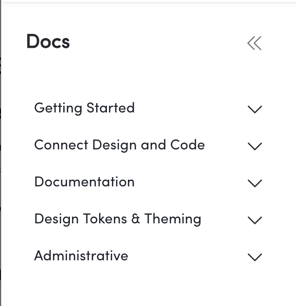
The Sidebar provides secondary navigation for sub-pages, patterns, or groups related to the selected top-level page. It also allows you to add and manage second-level entities to further organize your content.
Secondary Navigation
Navigate through sub-pages, patterns, or groups associated with the current top-level page.
Adding Second-Level Entities
Create and manage sub-level patterns, pages, groups, or external links to enhance your workspace structure.
For a guide on how to add second-level entities, have a look at this doc.
Content Region
Enhance Your Documentation with Dynamic Content Blocks
The Content Region is where you add and organize content blocks to build comprehensive and interactive documentation. These blocks allow you to incorporate various elements such as component variations, design tokens, and embeds to create a rich and informative documentation experience.

Adding Content Blocks
Utilize dynamic content blocks to add depth and functionality to your documentation, making it more engaging and useful for your users.
For a guide on how to add content blocks, have a look at this doc.