
Navigation
Overview
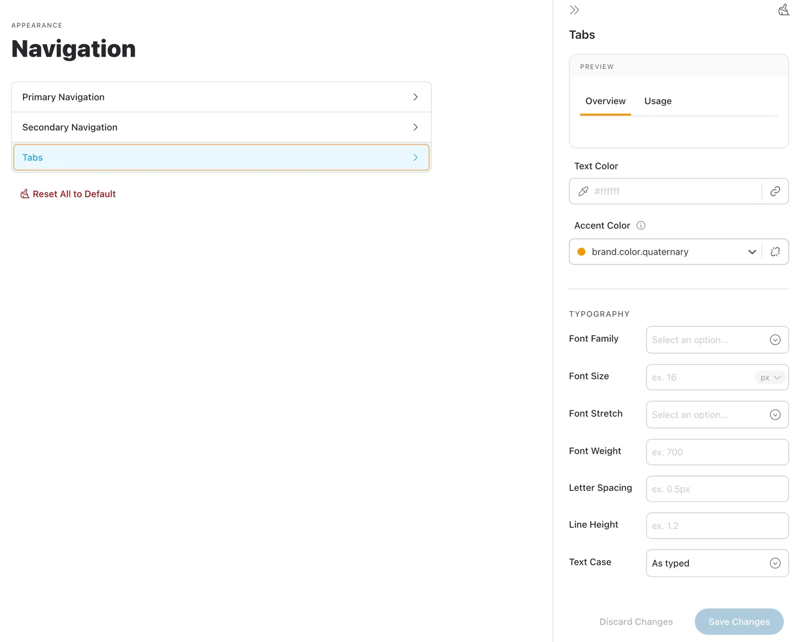
The “Navigation” dashboard allows you to customize the visual styles of the navigation elements in your Knapsack workspace. This includes the Primary Navigation bar, Secondary Navigation sidebar, and Tabs used within Pattern Pages.
By adjusting colors, typography, and other visual settings, you can ensure that your workspace navigation aligns with your brand’s aesthetic and provides a cohesive user experience. Whether you’re tweaking the text color of the Primary Navigation or fine-tuning the typography of Tabs, these settings offer extensive control over the appearance of your workspace’s navigation.
Accessing Navigation Settings
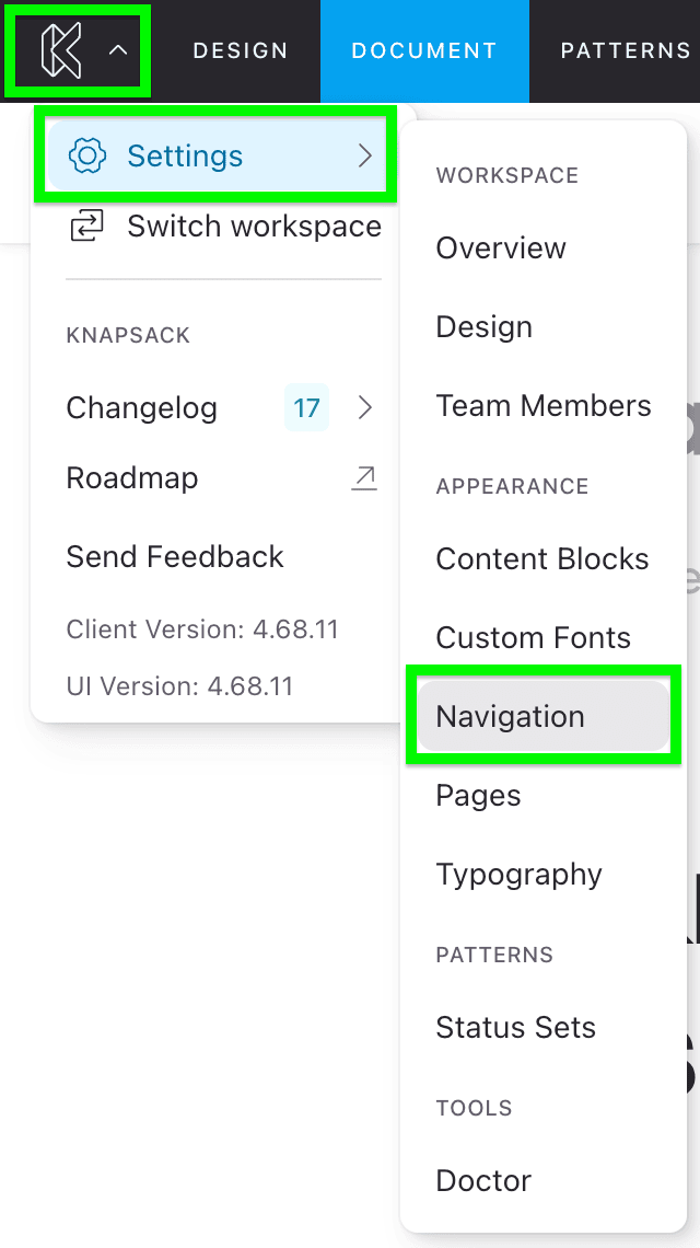
To access the Navigation settings, go to the app menu in the top left corner of the screen, select Settings, and navigate to Navigation.
Here, you’ll find customization options for three different navigation areas: Primary Navigation, Secondary Navigation, and Tabs.
Primary Navigation
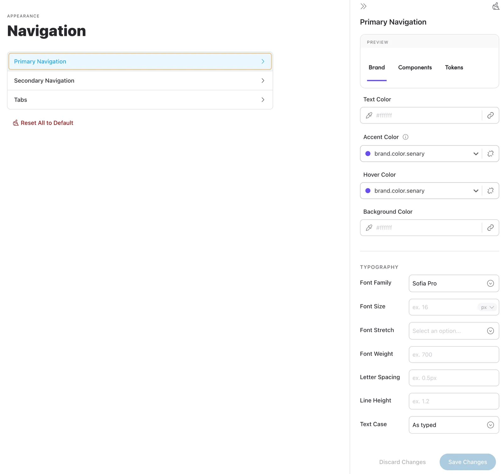
The Primary Navigation appears at the top of the workspace, directly below the admin bar.
Customization options include:
- Text Color
- Accent Color
- Hover Color
- Background Color
Typography settings available:
- Font Family
- Font Size
- Font Stretch
- Font Weight
- Letter Spacing
- Line Height
- Text Case
Secondary Navigation
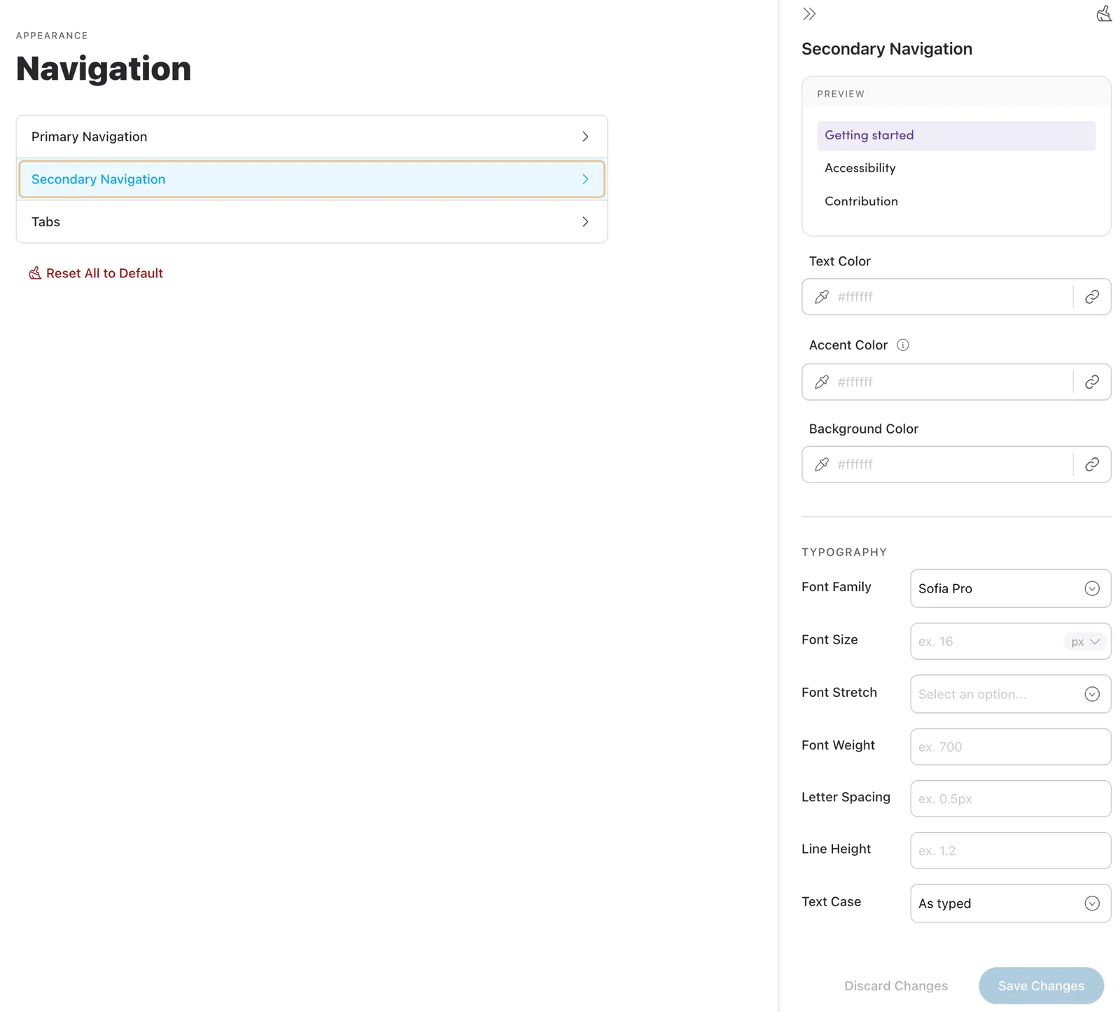
The Secondary Navigation is contained in the left sidebar.
Customization options include:
- Text Color
- Accent Color
- Background Color
Typography settings available:
- Font Family
- Font Size
- Font Stretch
- Font Weight
- Letter Spacing
- Line Height
- Text Case
Tabs
Tabs are located within Pattern Pages and correlate to either a design source, a sub-page (documentation), or a template (coded component).
Customization options include:
- Text Color
- Accent Color
Typography settings available:
- Font Family
- Font Size
- Font Stretch
- Font Weight
- Letter Spacing
- Line Height
- Text Case