
Patterns Grid Block
Display a grid of the patterns in your design system. This block arranges your design patterns in a visually appealing grid format, allowing users to quickly browse and identify different components.
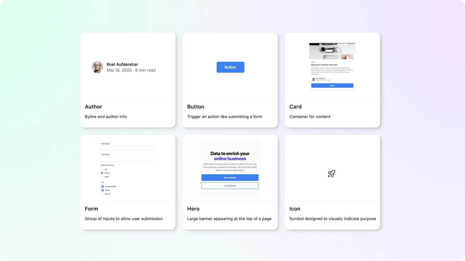
Create a quick list of every pattern, or a subset of patterns, in your system. Each card links directly to it’s Pattern page and stays in sync as your components change over time.
Patterns Grid options
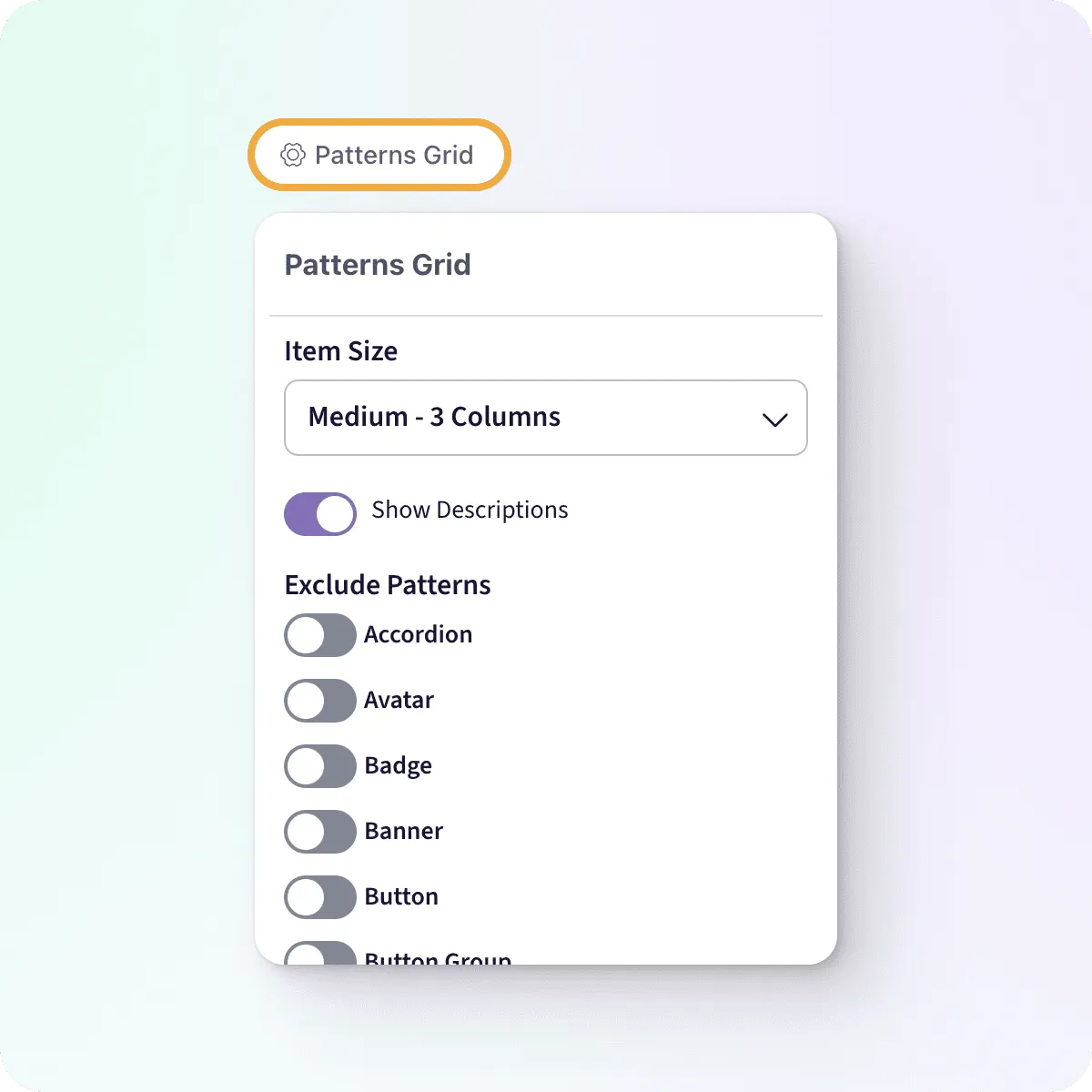
Hover over your block to expose the options trigger, then click to expand the options menu.
Item Size
Adjust the layout of the Patterns Grid to fit your desired aesthetic:
- Small - 4 Columns
- Medium - 3 Columns
- Large - 2 Columns
- Full Width
Default: Medium
Show Descriptions
Each card shows the description entered on the Pattern page. Toggle off all the descriptions if you want less information displayed.
Default: on
Exclude Patterns
By default the Patterns Grid shows a card for every pattern you’ve added to your workspace. You can choose to limit the Patterns that are displayed excluding specific items in the list.