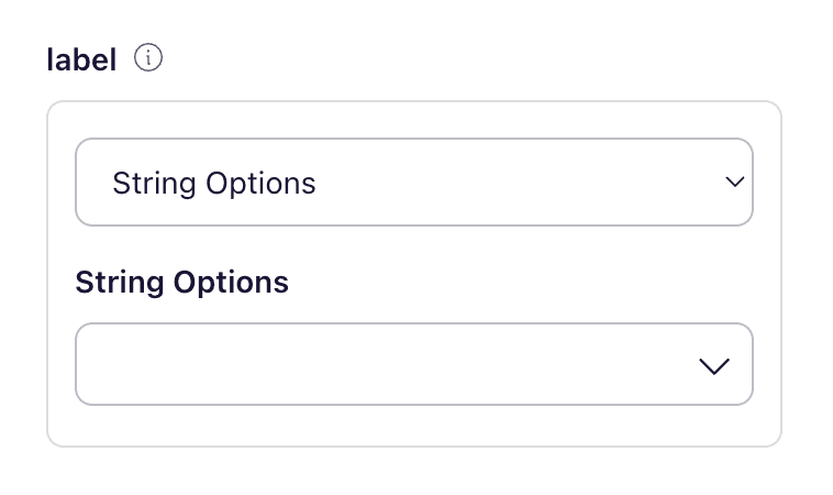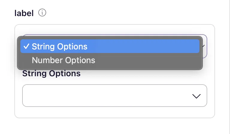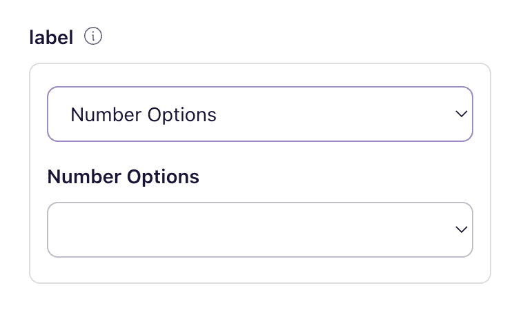

Using Multiple Prop Types
Note: This section assumes you’ve already read and understood the section in the previous document around how to add and edit the “Prop Spec”.
Overview
A design system component’s prop may need to accept multiple types to provide flexibility and accommodate various use cases. This section will cover the implementation and validation of props that can handle various data types, ensuring robust and adaptable components.
For instance:
- A “size” prop might accept different formats such as a string or number to cater to diverse design requirements.
- A string value like “caption” could correspond to a predefined font size, ensuring quick and consistent styling across components.
- A numeric value from 1 to 6 might offer more granular control over heading sizes.
By accepting multiple types, props become more versatile and enhance the adaptability of the design system to various design needs and developer preferences.
Step 1: Add new prop OR edit an existing
The first step in the process involves adding or editing an existing prop within the components spec.
Step 2: Click the "additional settings" arrow to further configure the prop
Clicking the “additional settings” arrow will allow for further configuration of prop types. If adding a new prop — use the “Custom” prop type.
Conclusion
Pulling it all together we can now use multiple prop types 🎉