

Managing Tokens in the UI
Overview
In Knapsack, managing design tokens through the user interface is an intuitive process that allows you to efficiently organize and maintain your design system without diving into code. This guide provides step-by-step instructions on how to navigate the Tokens Dashboard, add and organize tokens, and understand the impact of token IDs on output formats. By following these steps, you can ensure that your design tokens are accurately configured and easily accessible across your projects.
Step 1: Open the Tokens Dashboard
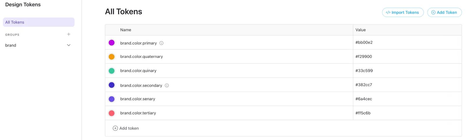
To get started, navigate to the Tokens Dashboard by clicking on the “Design” tab located in the upper left corner of the admin bar. This is where you can view, add, and manage all the design tokens within your workspace.

Step 2: Adding a New Token
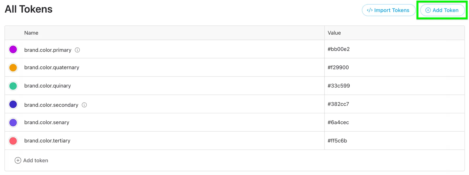
Within the Tokens Dashboard, you’ll find an “Add Token” button in the upper right corner. Click on it to begin the process of adding a new design token to your system.
Step 3: Fill out the Form
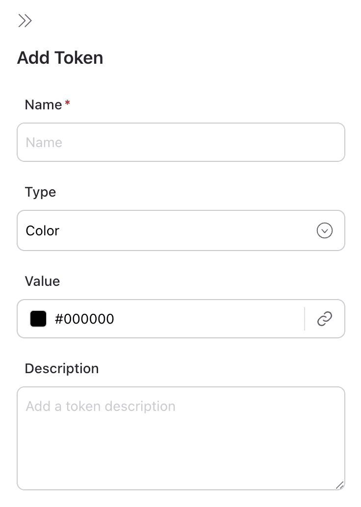
A form will appear on the right side of the screen, prompting you to enter details for your new token.
Complete the form with the following information:
- Name: For example, brand.color.primary
- Type: Select the type of token, such as Color
- Value: Input the value, e.g., #bb00e2
- Description: Provide a description, like “An example token for an imaginary primary color”
Managing Token Groups
On the left side of the Tokens Dashboard, you can expand the groups and click on a specific group, such as “color.” This action will display all tokens within the “brand.color” group. To add more tokens to a group, simply click the “Add Token” button at the bottom of the group’s table.
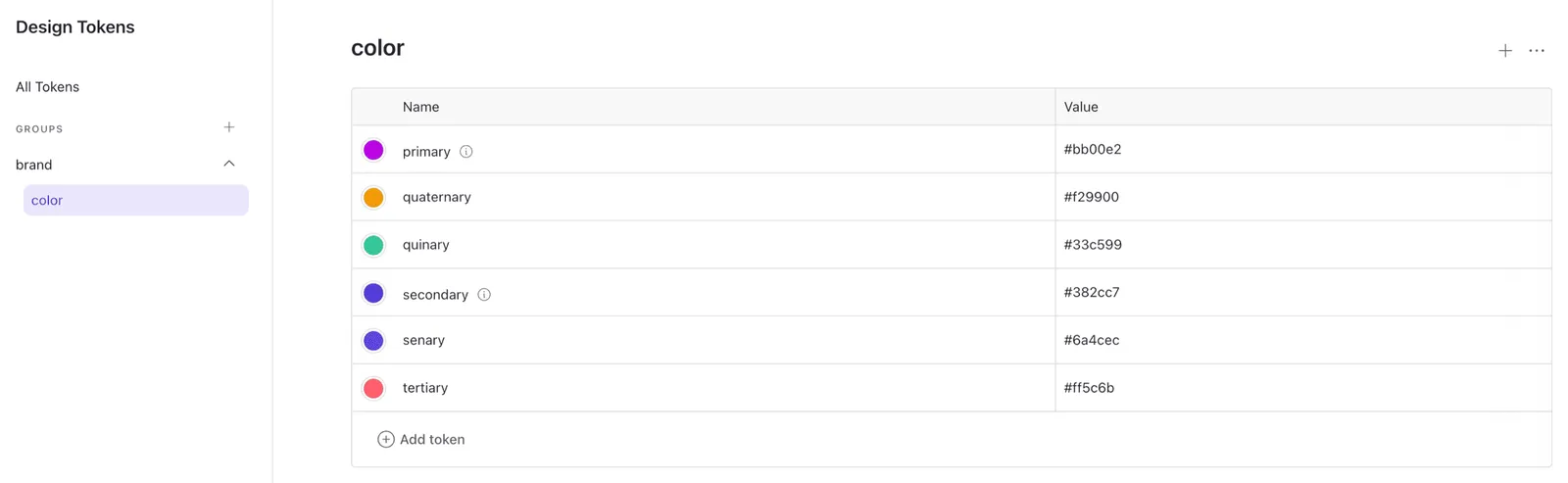
If you need to create new token groups, click the “Add Group” button in the bottom left sidebar navigation. You’ll then be prompted to enter the group’s name, description, and the type of tokens it will contain.
Understanding Token IDs
Each token in Knapsack is assigned a unique identifier (ID), which plays a crucial role in the naming of output formats.
For example:
brand.color.primarybrand.color.secondary
These IDs determine the names of the corresponding CSS, JavaScript, and SCSS variables in the output assets. For instance, the ID brand.color.primary would result in the following formats:
- CSS:
--brand-color-primary - SCSS:
$brand-color-primary - Less:
@brand-color-primary
List of Supported Formats
Knapsack supports a variety of formats for exporting design tokens, ensuring flexibility and compatibility across different development environments:
Web Formats
- .cjs: CommonJS module format for JavaScript
- .css: Cascading Style Sheets format
- .d.ts: TypeScript declaration file format
- .js: JavaScript module format
- .json: JSON format for data interchange
- .less: Less CSS pre-processor format
- .nested.json: Nested JSON format for organized data
- .scss: Sass CSS pre-processor format
- .style-dictionary: Style Dictionary format for exporting design tokens
Native Formats
- android.xml: Android XML resource file format
- .swift: Swift programming language format
These formats provide the versatility needed to integrate design tokens into various development workflows, whether you’re working on web or native applications.