
Guidelines Block
The Guidelines Block is designed to provide examples of how particular components should be used and to highlight common mistakes to avoid. This block helps ensure that your design components are used consistently and correctly, offering practical guidance and best practices for your team.

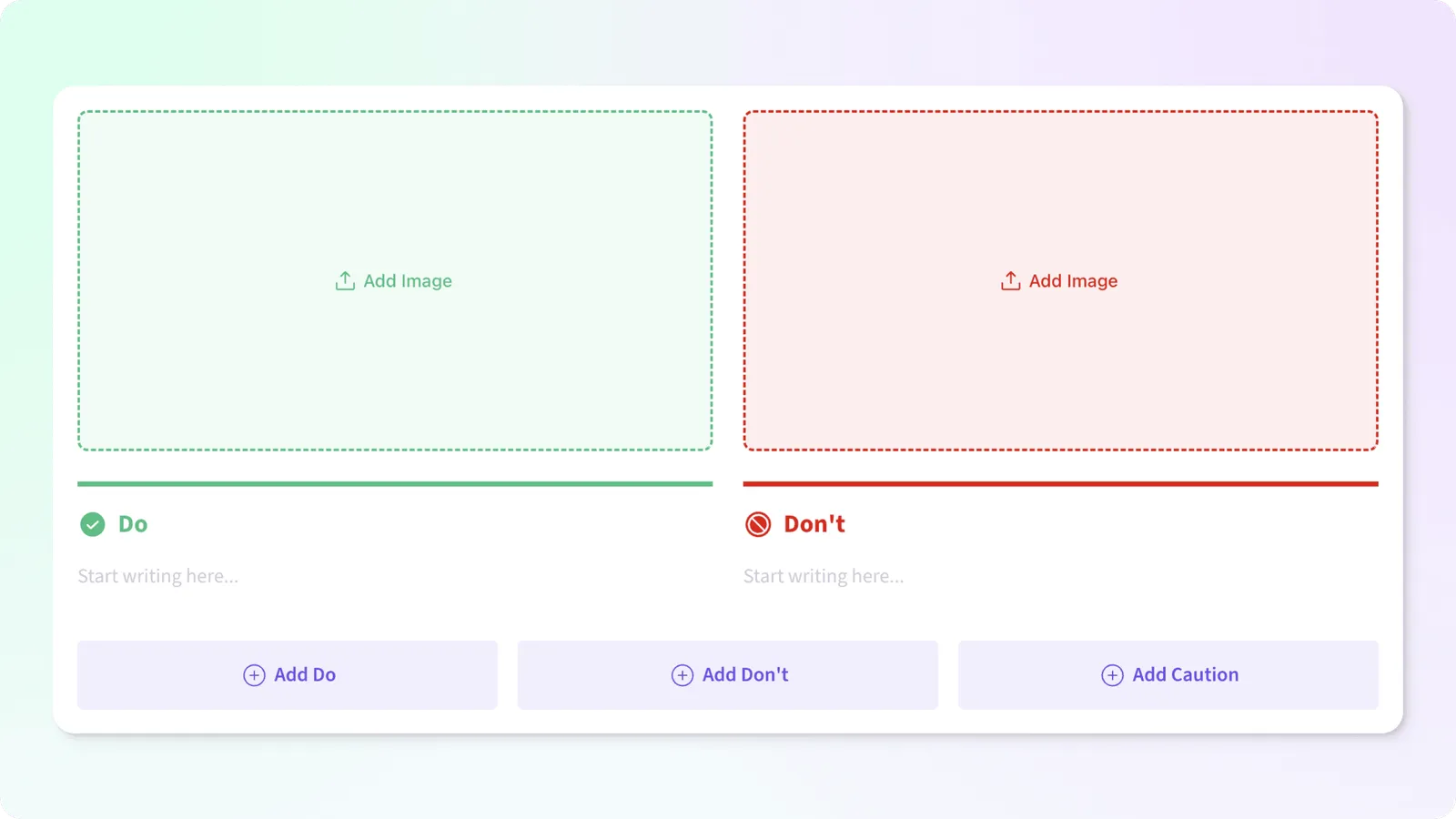
Our Guidelines block consists of do’s, don’ts, and cautions. Add as many as you need for your component to help your users create their best work.
Adding Guidelines
When you first add a Guidelines block, we include a Do and a Don’t tile. Below your guidelines is a row of quick add actions to add the specific type of Guideline you need.
Managing Guidelines
Utilize the guideline menu for swift actions such as effortlessly adding, editing, or removing images. Modify the guideline type or seamlessly eliminate it altogether with ease.

Guidelines Options
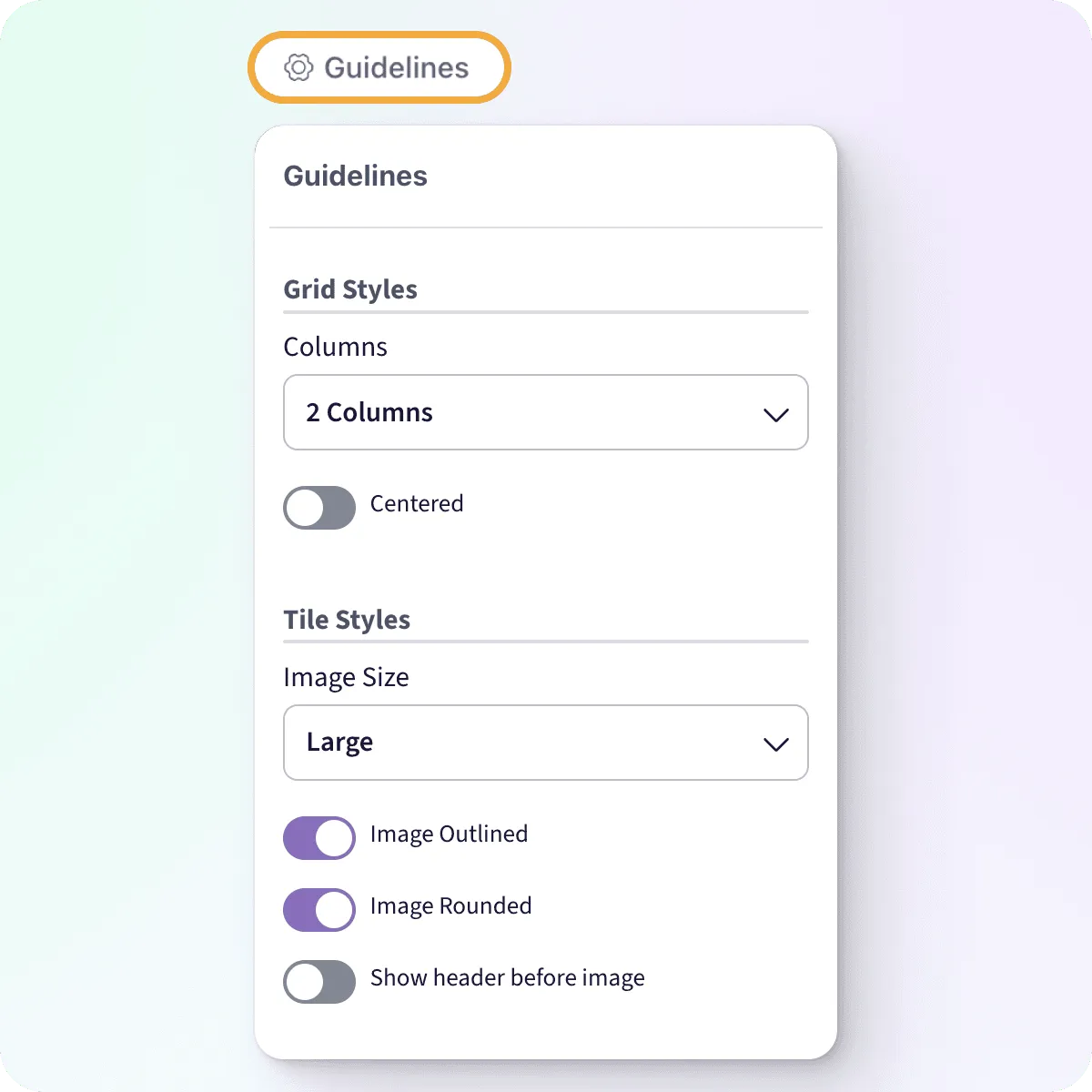
Hover over your block to expose the options trigger, then click to expand the options menu.
Grid Styles
Columns
Adjust the layout of the Guidelines block to fit your desired aesthetic:
- 4 Columns
- 3 Columns
- 2 Columns
- Full Width
Default: 2 Columns
Centered
When you have an odd number of items, center the last item instead of aligning it to the left.
Default: Off
Tile Styles
Image Size
Adjust the height of the image container for all tiles within the block.
- Extra Small - 80px
- Small - 120px
- Medium - 180px
- Large - 270px
- Extra Large - 405px
- None - Don’t show an image
Default: Large
Image Outlined
Include a border on the image container.
Default: On
Image Rounded
Round the corners of the image container.
Default: On
Show header before image
By default, the header appears below the image. You can adjust this by toggling on Show header before image
Default: Off